Best Expert Tips for Home Color Design and Renovation
Beyond the Basics: Understanding Color Harmonies
True color mastery means seeing beyond obvious matches. Sometimes the most exciting combinations come from unexpected places - a peacock's feathers, a weathered city wall, or a well-loved Persian rug. These organic inspirations often yield more interesting results than textbook color wheels.
Consider temporal harmonies too. How colors transition throughout the day under changing light creates living compositions that evolve like slow-motion fireworks.
Accessorizing with Intention: The Power of Small Details
Accessories are the jewelry of interior design. A single turquoise vase can make a beige room sing, while a cluster of brass candleholders adds instant warmth to cool grays. The key lies in restraint - let one or two standout pieces shine rather than creating visual noise.
Textiles offer easy color experimentation. Rotate throw blankets, swap pillow covers, or layer rugs to test color relationships without commitment. These low-risk changes can reveal surprising perfect pairings.
Embracing Contrast: Creating Visual Interest Through Opposites
Juxtaposition creates energy. Imagine a sleek modern chair in neon pink against rough brick walls, or an antique wooden chest in a glossy white hallway. These thoughtful collisions prevent spaces from feeling flat or overly coordinated.
Contrast works in scale too. Pair oversized graphic prints with delicate patterns, or balance solid color blocks with intricate textures. This push-and-pull creates dynamic tension that keeps eyes moving.
The Subtle Art of Neutrals: Layering for Depth and Dimension
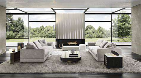
Neutrals are anything but boring when layered thoughtfully. Combine warm taupes with cool grays, mix matte and glossy finishes, or play with textured weaves to create rich, complex backdrops. These nuanced bases let colorful elements truly pop.
Consider neutrals as a spectrum rather than absolutes. The space between beige and gray holds endless sophisticated possibilities, especially when accented with natural wood tones and metallic finishes.
Matching Materials: Consistency in Texture and Finish
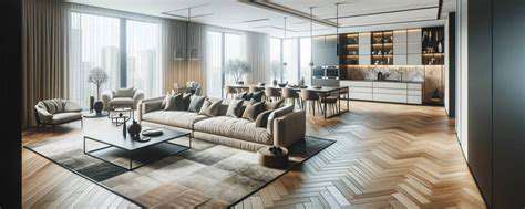
Material continuity creates subliminal harmony. A room with matte ceramic vases, linen curtains, and raw wood furniture feels cohesive even with varied colors. Conversely, mixing too many finishes - glossy, matte, metallic - can feel chaotic regardless of color coordination.
Don't overlook tactile qualities. A space should invite touch as much as sight, with a balanced mix of smooth, rough, soft, and hard surfaces that create sensory interest.
The Role of Lighting: Highlighting Color and Texture
Light transforms color like a magician's wand. The same wall color shifts from cozy amber at candlelight to crisp white under daylight bulbs. Smart lighting design uses these transformations to create adaptable spaces that change with the time of day and mood.
Directional lighting creates drama. Grazing a textured wall with light emphasizes its tactile quality, while backlighting translucent materials creates ethereal glows. These techniques add dimensional interest beyond flat color application.
Beyond the Room: Enhancing a Consistent Home Design
Whole-home color stories create powerful impressions. Maybe all rooms share a particular blue accent, or transition gradually from warm to cool tones as you move through spaces. These intentional progressions make homes feel thoughtfully composed rather than randomly assembled.
Signature colors become part of your home's identity. Whether it's a particular green inspired by your favorite landscape or a gold tone that recurs in unexpected places, these personal touches transform generic spaces into true reflections of their inhabitants.


