Complete Home Color Scheme Design for Trendy and Modern Interiors
Contents
Color theory guides base color selection in interior design.
Natural light affects color perception in spaces.
Paint finishes influence the appearance of chosen colors.
Trendy colors should align with personal style in design.
Accent colors add depth, harmony, and personality to interiors.
The 60-30-10 rule ensures color balance in design schemes.
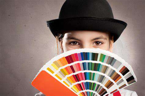
Color samples assist in visualizing designs before commitment.
Digital tools enhance color selection and visualization.
Feedback on color choices aids in achieving cohesive designs.
Current trends emphasize natural colors and bold accents.
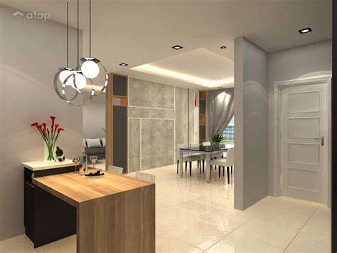
Choosing a Base Color for Your Interior
Understanding Color Theory
When it comes to picking a base color for your home's interior, color theory is your best friend. This approach focuses on creating harmony between different shades to shape how a room feels. The classic color wheel helps identify combinations that naturally work well together - think of how blue and orange pop when paired, perfect for adding life to contemporary spaces.
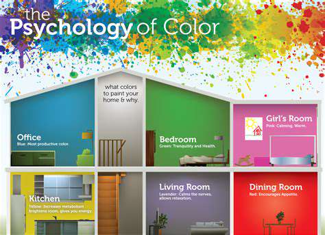
Did you know the colors around you actually affect your mood? Cool tones like blues and greens tend to calm people down, which explains why they're bathroom and bedroom favorites. Meanwhile, fiery reds or sunny yellows can pump up your energy levels - great choices for kitchens or home offices where you need that extra spark.
Assessing Natural Light and Space Size
Lighting dramatically changes how paint colors appear. Those north-facing rooms with limited sunlight? Lighter shades can prevent them from feeling like caves, while south-facing spaces can handle deeper, moodier tones. Pro tip: Always test swatches at different times of day using multiple lighting setups before committing.
Room dimensions matter too. Compact spaces benefit from airy pastels that create breathing room, while larger areas let you play with dramatic jewel tones without overwhelming the senses.
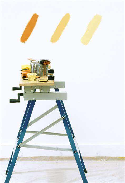
Selecting the Right Finish
That paint finish isn't just about looks - it's functional too. Matte options hide wall imperfections beautifully but stain easily, making them better for low-traffic areas. High-gloss finishes? They're wipe-clean champs perfect for busy kitchens, though they'll highlight every bump and crack. For most homes, satin or eggshell strikes the ideal balance between practicality and style.
Incorporating Trends and Personal Style
While Pantone's annual color announcements make headlines, your home should reflect YOU. Mix trendy shades with timeless neutrals for longevity. Create a physical mood board with fabric swatches, paint chips, and magazine clippings - seeing everything together helps spot clashes before they happen. When in doubt, an hour with an interior designer can save weeks of second-guessing.
Accent Colors: Adding Personality and Depth
Understanding the Role of Accent Colors in Home Design
Accent colors are the secret sauce of interior design. They're like punctuation marks for your rooms - exclamation points of color that guide the eye and create rhythm. A recent housing market study found strategic color accents can boost perceived home value by up to 5%.
Popular Accent Colors for Modern Interiors
- Moody teal for library nooks
- Mustard yellow in mid-century setups
- Terracotta for Mediterranean vibes
- Coral accents in coastal themes
- Lavender for shabby chic spaces
These aren't just pretty shades - they tell stories. Navy blue paired with brass details whispers luxury yacht, while terracotta with woven textures screams Tuscan villa.
Incorporating Accent Colors: Techniques and Tips
The 60-30-10 rule is your safety net against color overload. Think of it like a cocktail - 60% base spirit (walls), 30% mixer (furniture), 10% garnish (accents). Repeat your accent color in at least three places to create visual echoes that tie the room together.
Accent Colors and Psychological Impact
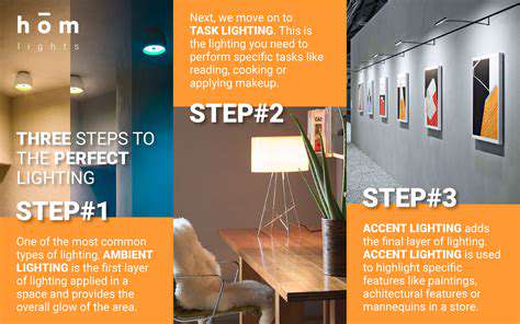
Color isn't just decoration - it's emotional programming. Green tones lower stress hormones (perfect for home offices), while yellow stimulates mental activity (great for craft rooms). Smart lighting can intensify or soften these effects throughout the day, adapting your space to different moods and activities.
Accent Colors for Different Architectural Styles
Match your accents to your home's bones. Modern farmhouses sing with barn red against shiplap, while Art Deco spaces demand metallics and emerald green. The key is enhancing - not fighting - your home's inherent character. Those vintage crown moldings? They'll pop with a contrasting accent hue in the recesses.
Utilizing the 60-30-10 Rule for Balanced Design
Understanding the 60-30-10 Color Distribution
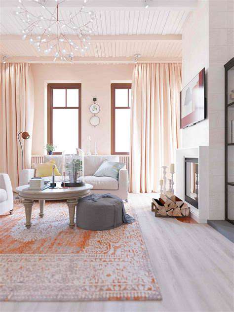
This golden ratio prevents color chaos. Your dominant color (60%) acts as the stage - think walls and large furniture. The secondary color (30%) supports the lead - maybe your sofa or curtains. The accent 10% is where you have fun - throw pillows that pop, art that demands attention. It's like a well-composed photo - foreground, midground, background.
Choosing the Right Colors for Your Space
Light quality changes everything. North-facing rooms need warm undertones to combat gray light, while south-facing spaces can handle cooler hues. Test swatches vertically (walls catch light differently than horizontal samples) and live with them for a week - you'll notice changes at dawn, noon, and dusk.
Implementing the Rule in Various Design Styles
Even maximalism needs structure. For eclectic spaces, let your 60% be a neutral that grounds wild patterns. In monochromatic schemes, play with texture variations to maintain interest - a glossy 60%, matte 30%, and metallic 10% can work magic.
Testing Your Color Choices Through Samples
Understanding the Importance of Color Samples
Paint directly on poster boards you can move around the room - colors look different on east vs west walls. Notice how morning sun warms cool grays into something completely different than afternoon light.
Choosing the Right Type of Samples
Digital tools are great starters, but nothing beats physical samples. Collect actual fabric swatches and tile pieces to see how materials interact. That perfect gray paint might clash with your stone countertops in certain lights.
Testing Colors in Different Lighting Conditions
Use smart bulbs to cycle through different light temperatures. Notice how your chosen green turns sickly under warm LEDS but magical with daylight bulbs. This step alone can prevent expensive repaints.
Staying Ahead of Color Trends
Understanding Color Psychology
Smart lighting systems let you change color moods instantly. Program morning energize yellows and evening unwind blues - your walls stay neutral while lights do the heavy lifting.
Current Color Trends in Interior Design
2024's standout? Biophilic greens paired with clay neutrals - bringing the outdoors in without the pollen. For bold souls, try accent ceilings in saturated hues - it's like wearing a fabulous hat for your room.
Practical Tips for Implementing Color Trends
Trends come and go - invest in timeless big pieces and go wild with removable accents. Those pricey emerald green cabinets? Try contact paper first. Love it after six months? Then commit with paint or replacement doors.
Read more about Complete Home Color Scheme Design for Trendy and Modern Interiors