Expert Guide to Selecting Home Decor Accessories
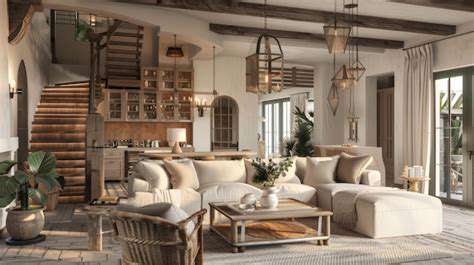
Accessorizing for Functionality and Aesthetics
Accessorizing for Everyday Convenience
Choosing accessories that serve a dual purpose of enhancing aesthetics and boosting functionality is crucial for a well-designed home. Think about how items like decorative trays can not only elevate the visual appeal of a coffee table but also provide a practical space for holding remotes, magazines, and other small items, keeping your living space organized and clutter-free. Strategically placed baskets and storage solutions can similarly improve both the look and the functionality of your home, creating a space that is both beautiful and practical.
Consider the specific needs of each room. In a kitchen, attractive canisters or spice racks can add a touch of charm while keeping your spices and pantry items organized. In a bathroom, stylish storage solutions like baskets or decorative bowls can help corral toiletries and keep the space tidy and visually appealing.
Elevating Visual Appeal with Texture and Pattern
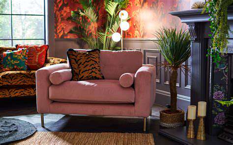
Accessorizing with items that incorporate diverse textures and patterns can add depth and visual interest to a room. Experiment with different materials, from the soft touch of a plush throw blanket to the intricate weave of a patterned rug. Adding contrasting textures can create a visually stimulating and inviting atmosphere.
Consider the overall color scheme of the room when selecting accessories with patterns and textures. A room with a predominantly neutral color palette can benefit from accessories that feature bold patterns and vibrant colors. Conversely, a room with bold colors can benefit from accessories with subtle patterns or soft textures to balance the overall aesthetic.
Strategic Placement for Maximum Impact
The placement of accessories plays a significant role in their overall impact. Don't overcrowd a space. Instead, strategically place key pieces to create focal points and draw attention to specific areas of the room. Using a combination of large and small pieces can create visual interest without overwhelming the space.
Consider the scale of the furniture and the size of the room when choosing the size of your accessories. Large, bold accessories can be perfect for larger rooms, while smaller, more delicate items can be ideal for smaller spaces. The goal is to create a balanced and harmonious look that complements the room's dimensions and style.
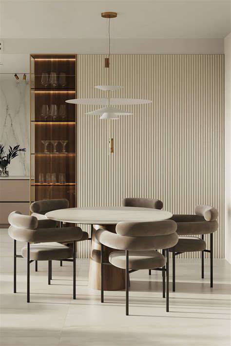
Coordinating Colors and Styles for Harmony
Creating a cohesive look involves coordinating the colors and styles of your accessories with the existing décor. Choose colors that complement the room's existing color palette, whether it's a calming neutral scheme or a vibrant, bold design. By considering the existing color scheme and furniture style, you can create a consistent look that enhances the overall aesthetic of the room.
Consider the overall style of your home when selecting accessories. If your home features a modern aesthetic, choose accessories that reflect this style. Conversely, if your home is more traditional or rustic, select accessories that align with these design aesthetics. This ensures that your accessories enhance the overall style and atmosphere of your home.
Adding Personal Touches for Warmth and Character
Incorporating personal touches into your accessories is a great way to add warmth and character to your home. Displaying family photos, cherished souvenirs, or items from travels are excellent ways to express your personality and create a space that truly reflects your unique style and memories. These pieces can add a personal touch that makes your home feel more welcoming and cozy.
Accessorizing for Seasonal Changes
Seasonal changes provide opportunities for refreshing your home's aesthetic with the introduction of new accessories. Incorporate seasonal colors, textures, and patterns into your accessories to reflect the time of year. Using seasonal elements can add a sense of excitement and anticipation to the evolving seasons.
This could involve adding fall-themed items like pumpkins and gourds, or changing out your throw pillows and blankets to match the colors of spring. These simple changes can dramatically transform the feel of a room without requiring a complete overhaul of the existing décor.
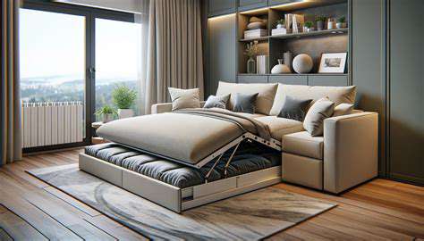
Accessorizing for Different Room Styles
Different rooms in your home have unique personalities and require unique accessorizing strategies. A living room might benefit from more substantial, statement pieces that complement the seating and flooring, while a bedroom might thrive on softer, more intimate accents. A bathroom might benefit from a more minimalist approach with sleek and stylish accessories, while a kitchen might benefit from brightly colored or patterned accents to add energy to the space.
Understanding the specific needs of each room and adapting your accessorizing choices accordingly is crucial to creating a cohesive and functional home that reflects your personal style and the specific purpose of each room.
Choosing the Right Scale and Proportion

Choosing the Right Scale for Your Project
Selecting the appropriate scale for a project is crucial for its success. A scale that's too small may not capture the necessary details, while a scale that's too large can lead to overwhelming complexity and potentially inaccurate results. Careful consideration of the project's goals and the available resources is paramount in determining the optimal scale. Understanding the intended audience and the desired level of detail is also key to making the right choice.
A well-defined scale allows for a clear understanding of the relationship between different elements within the project. This understanding is essential for accurate representation and effective communication. Choosing the right scale is a fundamental aspect of any project requiring visual representation.
Proportional Representation
Proportional representation, a key element in accurate visualization, ensures that the relationships between elements are maintained in the representation. This is essential for accurate representation of size and spatial relationships. Failing to adhere to proportional representation can lead to misinterpretations and flawed conclusions.
Maintaining proportionality is crucial for creating a reliable and accurate visual representation. This ensures that the visual representation accurately reflects the real-world relationships.
Factors Influencing Scale Choice
Several factors influence the selection of the appropriate scale. These factors include the size of the subject matter, the intended use of the representation, the available resources (e.g., materials, time, budget), and the desired level of detail. Considering these factors is crucial in ensuring the chosen scale aligns with the project's goals.
Project complexity and the desired level of detail directly impact the scale choice. Simpler projects often benefit from a larger scale, while intricate projects may require a smaller scale to maintain clarity. A good understanding of these factors prevents costly errors and ensures the project aligns with the intended outcome.
Scale and Accuracy
The relationship between scale and accuracy is undeniable. A precise scale ensures that the representation accurately reflects the dimensions and proportions of the subject. This is vital in various fields, including engineering, architecture, and scientific research, where precise measurements are paramount. Using an inappropriate scale directly impacts the accuracy of the representation.
Scale and Communication
Effective communication relies on a clear understanding of the scale used. This understanding helps ensure that the intended message is conveyed accurately. A poorly chosen scale can lead to misinterpretations and misunderstandings. Clear communication of the scale is essential for effective project execution and interpretation.
Choosing an appropriate scale significantly impacts the clarity and comprehensibility of the representation for the intended audience. A carefully selected scale facilitates effective communication of the project's core message.
Practical Considerations
Practical considerations play a significant role in selecting the right scale. These include the limitations of the available tools and materials, the time constraints of the project, and the budget allocated. These practical constraints should be carefully evaluated to ensure the chosen scale is feasible and achievable within the project's parameters.
Considering practical constraints helps to ensure the project remains realistic and attainable. Understanding and accounting for these constraints is crucial for successful project completion.
Incorporating Texture and Color
Exploring the Role of Texture
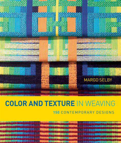
Texture plays a crucial role in visual appeal and adds depth to any design. It can evoke a wide range of emotions, from the smooth, calming feel of silk to the rough, rugged texture of stone. Understanding how different textures interact with each other and with color is essential for creating a cohesive and impactful design. Careful consideration of texture can transform a simple design into something truly extraordinary.
Incorporating various textures, such as smooth, rough, or patterned surfaces, can significantly enhance the visual interest of a space or object. This variety can add depth and dimension, leading to a more engaging and compelling aesthetic experience for the viewer or user.
The Impact of Color Psychology
Color psychology is a fascinating field that explores how different colors evoke specific emotions and associations. Understanding these associations can help you choose colors that effectively communicate the desired message or mood. For example, warm colors like red and orange can create a sense of energy and excitement, while cool colors like blue and green can promote feelings of calmness and serenity. It's important to consider the context and the intended effect when selecting colors for a design.
Blending Textures for Visual Interest
Combining different textures can create a dynamic and visually stimulating effect. Pairing a smooth surface with a rough one, for instance, can introduce visual contrast and intrigue. This approach can make a design more interesting and engaging. By strategically combining textures, you can add a layer of complexity and visual intrigue to your design.
Contrasting textures can draw the eye and create a sense of depth and dimension. This contrasts can be achieved by juxtaposing smooth surfaces with rough ones or patterned textures with plain ones. Experimenting with various combinations is key to discovering the most effective textures for your design goals.
The Harmony of Color Combinations
Color combinations are critical in creating a cohesive and aesthetically pleasing design. Understanding color theory, including complementary, analogous, and triadic color schemes, can help you choose colors that work well together. Knowing how colors interact can significantly impact the overall mood and effect of your design.
The Power of Color Contrast
Color contrast is essential for readability and visual impact. Using contrasting colors, like black and white or red and green, can create a strong focal point and draw attention to important elements. High contrast color choices also contribute to a design's overall clarity and impact.
Creating a Unified Design
While texture and color variations are important, ensuring a unified design is equally critical. Consistency in the use of textures and colors throughout a design project creates a cohesive and harmonious aesthetic. This consistency helps the design feel complete and well-considered. Maintaining a unified design approach is key to achieving a professional and polished look.
The Importance of Context
Ultimately, the best way to incorporate texture and color is to consider the specific context of the design. The intended audience, the purpose of the design, and the overall message need to be carefully considered. For example, a vibrant color scheme might be suitable for a children's book, but less appropriate for a corporate report. Adapting your use of texture and color to the specific context is essential for achieving desired results.
Read more about Expert Guide to Selecting Home Decor Accessories