Expert Home Color Design with Emphasis on Mood and Harmony
While wall colors set the foundation, don't underestimate the power of incorporating color through accessories, furniture, and textiles. A carefully chosen throw pillow, a vibrant rug, or a striking piece of artwork can add personality and visual interest to a space, without overwhelming the room with color. Using different shades of the same color family in various elements of the room can create a cohesive and well-balanced aesthetic. For example, you could use a deep teal on the walls, then repeat the teal in smaller items like cushions and decorative objects. This creates a sense of unity and harmony throughout the room.
Don't be afraid to experiment with color combinations. Mixing and matching colors can create unique and engaging designs. For example, you might pair a calming blue with a warm yellow for a soothing yet energetic atmosphere, or combine a bold red with a neutral grey for a dramatic yet sophisticated look. Remember, the key is to create a harmonious balance that reflects your personal style and preferences while also creating a welcoming and inviting atmosphere for yourself and your guests.
The Psychology of Color in Interior Design
Color Psychology and Mood
Understanding the psychological impact of color is crucial in interior design. Different colors evoke different emotions and can significantly influence the atmosphere of a space. For instance, warm colors like red and orange can create a feeling of energy and excitement, perfect for a vibrant living room. Conversely, cool colors like blue and green can promote feelings of calmness and serenity, ideal for a relaxing bedroom or a tranquil study. Careful consideration of these psychological effects ensures that the chosen colors effectively support the intended mood and purpose of each room.
Color psychology is a complex field, and the effects of color are often influenced by cultural and personal associations. What one person finds calming, another may find oppressive. Therefore, it's essential to consider the target audience and individual preferences when selecting colors. A deeper understanding of color psychology allows designers to tailor color palettes to elicit specific responses and create spaces that resonate with the inhabitants.
The Impact of Color on Perception
Colors can dramatically alter how we perceive a space. A room painted in bright, light colors can feel larger and more open, while darker shades can create a sense of intimacy and coziness. The perception of depth and distance can also be manipulated with color choices. For example, using a darker shade for the walls and a lighter shade for the trim can create an illusion of greater depth.
Color and Emotional Responses
Colors evoke potent emotional responses. Red, associated with passion and energy, can be stimulating but also overwhelming in large doses. Blue, often linked to tranquility and calmness, can foster a sense of peace and serenity. Green, a color often associated with nature, can create a feeling of harmony and balance. The careful selection of colors can help to foster a specific emotional environment within a space.
Color and Individual Preferences
Personal preferences play a significant role in color selection. What one person finds aesthetically pleasing, another may not. Cultural backgrounds and individual experiences can shape our emotional responses to colors. For example, the color white might symbolize purity and cleanliness in one culture, while it might hold a different meaning or connotation in another. Designers must consider individual preferences and cultural nuances to ensure that the chosen color palette resonates with the intended occupants.
Color Combinations and Harmonies
Creating visually appealing and harmonious color schemes is essential in interior design. Understanding color theory, including complementary, analogous, and triadic color schemes, can guide the selection of colors that work well together. These combinations can affect the overall mood, ambiance, and aesthetic appeal of a space. A well-considered color palette can elevate the visual impact of a room and create a cohesive and aesthetically pleasing design.
Balancing Color Schemes for Visual Harmony

Choosing the Right Color Palette
Selecting a color palette is crucial for creating a visually appealing and harmonious design. A well-balanced color scheme can draw the viewer's eye to specific elements, evoke specific emotions, and ultimately enhance the overall impact of the design. Understanding color theory principles is essential for making informed choices. Consider the mood you want to convey and how different colors interact with each other.
Different color combinations evoke different responses. Warm colors like reds, oranges, and yellows can create a sense of energy and excitement, while cool colors like blues, greens, and purples often evoke feelings of calmness and serenity. Knowing how these color associations can influence perception is key to successful design.
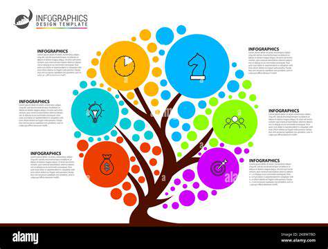
Understanding Color Harmony
Color harmony refers to the pleasing arrangement of colors. Various color schemes exist, including analogous, complementary, triadic, and monochromatic schemes. Understanding these schemes allows designers to create visually appealing and cohesive compositions. Each scheme offers unique visual impacts, and the choice depends on the specific design goals.
Analogous color schemes use colors that are adjacent on the color wheel, creating a sense of unity and harmony. Complementary color schemes use colors opposite each other on the color wheel, producing a high-contrast and vibrant effect. These different approaches to harmony can significantly impact the visual experience.
Considering Visual Hierarchy
Visual hierarchy is essential for guiding the viewer's eye through the design. Colors play a significant role in establishing this hierarchy. Darker colors often attract more attention than lighter ones, and using contrasting colors can create focal points. Effective use of color can lead to a more intuitive and engaging user experience.
Contrast is key to establishing visual hierarchy. High contrast between colors makes elements more noticeable. This effect can be used to emphasize important information and to draw the viewer's eye to key areas of the design. Strategic use of color contrast can significantly improve the clarity and impact of the design.
Applying Color Psychology
Color psychology explores the emotional responses associated with different colors. Different colors evoke different feelings and associations. Understanding these associations is important for creating a design that resonates with the target audience. For instance, blue often conveys trust and reliability, while red often signifies energy and excitement. Knowing the psychological impact of colors is crucial for tailoring the design to evoke the desired emotional response.
The application of color psychology extends beyond simple aesthetics. It can significantly influence user behavior and perceptions. Understanding how colors affect emotions and motivations can lead to more effective communication and design. Thoughtful consideration of color psychology can lead to a design that fosters a desired emotional connection with the viewer.
Maintaining Accessibility
Color contrast is critical for accessibility. Ensuring sufficient contrast between text and background colors is essential for users with visual impairments. Guidelines from organizations like the Web Content Accessibility Guidelines (WCAG) provide specific recommendations for achieving adequate color contrast. Adhering to these guidelines ensures that the design is usable and inclusive for all users.
Using color effectively requires careful consideration of potential accessibility issues. Failing to meet accessibility standards can exclude users with visual impairments, creating a barrier to their engagement. Implementing accessible color schemes is not just ethical, it's essential for creating truly inclusive designs.
Considering the Impact of Natural Light and Room Size

Understanding the Interplay of Natural Disasters and Human Activities
Natural disasters, such as earthquakes, floods, and wildfires, have always been a part of the Earth's dynamic systems. However, the increasing frequency and intensity of these events, coupled with the ever-expanding human footprint on the planet, have created a complex interplay that demands careful consideration. Understanding how human activities, from deforestation to urbanization, exacerbate the impact of natural disasters is crucial for developing effective mitigation and adaptation strategies. The consequences of this interplay are often devastating, impacting communities and economies in profound ways. This complex relationship necessitates a deep understanding of both natural processes and human interventions to predict, prepare for, and respond to these events effectively. It's not simply about the force of nature, but the vulnerability of our human systems in the face of it.
The alteration of natural landscapes through deforestation, agricultural practices, and urban sprawl can significantly alter drainage patterns, increase erosion, and disrupt natural floodplains. These changes can lead to more severe flooding events and increased risk of landslides. Furthermore, the concentration of populations in vulnerable coastal areas, often driven by economic opportunities, amplifies the impact of tsunamis and storm surges. This underscores the urgent need for a more holistic approach to development, incorporating environmental considerations into planning and decision-making processes. Ignoring these factors can lead to a vicious cycle of increasing vulnerability and disaster impact, making communities less resilient and more susceptible to future events.
Developing Effective Mitigation and Adaptation Strategies
Effective mitigation and adaptation strategies are crucial to minimizing the impact of natural disasters. These strategies must encompass a wide range of approaches, from improving infrastructure resilience to promoting sustainable land-use practices. Robust building codes and early warning systems are essential components of disaster preparedness, saving lives and minimizing property damage. These elements are essential for protecting vulnerable populations and infrastructure. Integrating climate change projections into urban planning can help communities anticipate and prepare for future risks, ensuring that development occurs in a way that minimizes harm.
Sustainable land-use practices, such as reforestation and conservation efforts, can help to restore natural buffers and enhance the resilience of ecosystems. These strategies can help to mitigate the impact of natural disasters by restoring balance to natural systems. Implementing these strategies requires collaboration between governments, communities, and experts, fostering a shared responsibility for creating safer and more resilient environments. International cooperation and knowledge sharing are also vital in developing and implementing effective solutions to the complex challenges posed by natural disasters.
Beyond the Basics: Incorporating Personal Style

Beyond the Fundamentals of Paragraph Structure
Paragraphs are more than just collections of sentences; they are the building blocks of coherent and engaging writing. Understanding the fundamental principles of paragraph construction is crucial for conveying information clearly and effectively. A well-structured paragraph not only presents a unified idea but also guides the reader smoothly through your arguments and observations.
Mastering paragraph organization is key to achieving a compelling narrative or argumentative piece. This involves understanding the relationship between sentences and how they contribute to a larger theme. Pay close attention to transitions and how they connect ideas, ensuring a logical flow from one sentence to the next. This deliberate construction is essential for maintaining reader engagement.
Developing Paragraph Cohesion
Achieving cohesion within a paragraph involves more than just stringing sentences together. It's about crafting a unified message, where each sentence contributes to the overall point. This requires careful consideration of transitions, repetition of key words and phrases, and the use of pronouns to maintain a clear connection between ideas.
Effective transitions are vital for guiding the reader through your writing. They act as bridges between sentences, paragraphs, and even sections of a larger document. Choosing precise transitional words and phrases is crucial for creating a logical progression of thought. This helps your writing flow smoothly, and avoids jarring shifts in ideas.
Employing Paragraph Variety
While maintaining a consistent structure is important, don't be afraid to experiment with paragraph length and style. Varying paragraph length can add rhythm and dynamism to your writing. Short paragraphs can create a sense of urgency or excitement, while longer paragraphs allow for more in-depth exploration of a topic.
Incorporating Supporting Evidence
A strong paragraph doesn't just assert ideas; it supports them with evidence. This could be in the form of examples, statistics, expert opinions, or anecdotes. Including such supporting evidence enhances the credibility of your writing and persuades the reader of your points. Using evidence effectively is essential for building a robust argument.
Supporting evidence is critical to building a persuasive argument. It's not enough to simply state an opinion; you need to back it up with concrete examples and verifiable data. This will strengthen your writing and allow readers to connect with your ideas on a deeper level.
The Power of Visual Cues
Paragraphs are not just about words. Visual cues like indentation, headings, and even bullet points can significantly improve readability. They help break up large blocks of text and draw the reader's attention to key points. Proper use of visual cues ensures your writing is easily digestible and visually appealing. Applying these techniques will make your content more accessible and engaging.
Using visuals to enhance the readability of paragraphs is a powerful tool. Visual cues and formatting can significantly improve engagement with your work. They not only make the content easier to follow, but they also enhance its aesthetic appeal, making it more visually appealing and memorable. This is especially important in academic and professional contexts.
Read more about Expert Home Color Design with Emphasis on Mood and Harmony