How to Achieve Stylish Home Interiors with Color Harmony
Understanding Color Theory
Color theory is a fundamental aspect of design, encompassing the relationships between colors and how they interact visually. Understanding color harmonies, such as complementary, analogous, and triadic schemes, allows designers to create visually appealing and balanced compositions. This knowledge is crucial for achieving a cohesive and aesthetically pleasing home environment, whether you're painting a wall, selecting furniture, or choosing textiles.
Different color combinations evoke different emotional responses. Warm colors like reds and oranges can create a sense of energy and excitement, while cool colors like blues and greens can promote tranquility and calmness. Knowing how colors interact is key to creating a home that reflects your personal style and desired atmosphere.
Complementary Color Combinations
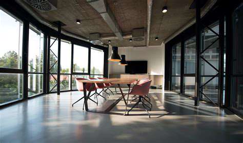
Complementary colors are located directly opposite each other on the color wheel, such as red and green, or blue and orange. These pairings offer a high degree of contrast, making them visually striking and effective for accent walls, bold artwork, or decorative elements. Using complementary colors strategically can create a dynamic and eye-catching design, but it's important to use them in moderation to avoid overwhelming the space.
The strong contrast between complementary colors can be used to draw attention to specific features or to create a focal point in a room. A well-balanced combination of complementary colors can create a visually interesting and stimulating environment, but it's vital to consider the overall effect on the room's mood and atmosphere.
Analogous Color Schemes
Analogous color schemes utilize colors that are adjacent to each other on the color wheel, such as shades of blue, green, and teal. These schemes create a sense of harmony and cohesion, offering a more subtle and calming visual experience. They are often used in bedrooms or living areas to promote relaxation and create a tranquil ambiance.
Analogous color palettes offer a sense of visual unity and flow, making them perfect for creating a cohesive and calming environment. By selecting shades within a limited range of colors, you can achieve a sophisticated and aesthetically pleasing look, enhancing the overall harmony and visual appeal of the space.
Triadic Color Combinations
Triadic color schemes utilize three colors that are evenly spaced around the color wheel, such as red, yellow, and blue. These combinations offer a vibrant and energetic feel, often suitable for kitchens, dining rooms, or play areas. These schemes can be highly effective for creating a cheerful and stimulating environment but can also be overwhelming if not used judiciously.
Using Color Accents Strategically
Beyond primary color schemes, consider using accent colors to add personality and visual interest to your home. An accent color can be used for a single piece of furniture, a patterned rug, or a collection of decorative objects. A carefully chosen accent color can transform a room from bland to vibrant and stylish.
Strategic color choices can significantly impact the overall aesthetic and feel of a room or home. Using colors thoughtfully and strategically will greatly enhance the visual appeal and create a home that reflects your personal style and desired atmosphere. Pairing colors in a harmonious way is essential for creating a visually appealing and balanced interior design.

Achieving Balance and Visual Interest with Color
Understanding the Psychology of Color
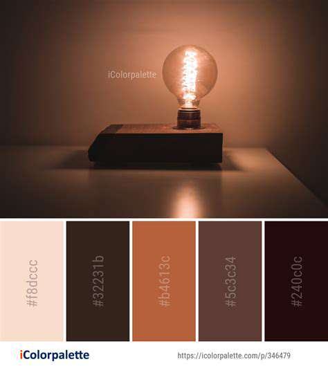
Color has a profound impact on our emotions and perceptions, making it a powerful tool in interior design. Warm colors like reds, oranges, and yellows evoke feelings of energy, excitement, and warmth, often associated with comfort and sociability. These hues can be particularly effective in living rooms or dining areas, stimulating conversation and creating a welcoming atmosphere. Conversely, cool colors like blues, greens, and purples often promote feelings of calm, serenity, and tranquility, making them ideal for bedrooms or bathrooms where relaxation is desired. Understanding these psychological effects allows you to strategically use color to shape the mood and atmosphere of different spaces within your home.
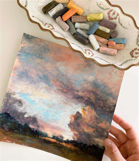
Consider how different shades and tones of the same color can further influence the mood. A vibrant, saturated red can feel stimulating, while a muted, dusty rose can feel softer and more romantic. Understanding these nuances will allow you to fine-tune your color choices and create a personalized and balanced aesthetic.
Creating Visual Harmony Through Color Schemes
Color schemes are crucial for achieving visual harmony and flow in a space. Using a cohesive palette, whether it's monochromatic, analogous, complementary, or triadic, ensures a unified look. A monochromatic scheme uses variations of a single color, creating a sophisticated and calming effect. Analogous schemes use colors that sit next to each other on the color wheel, producing a sense of harmony and visual connection. Complementary colors, positioned opposite each other on the color wheel, offer high contrast, perfect for adding visual interest or highlighting specific features.
Triadic schemes utilize three colors equidistant on the color wheel, offering a vibrant and energetic feel. Experimenting with different schemes allows you to explore various aesthetics and find the one that best suits your personal style and the desired ambiance of each room. Careful consideration of color schemes is essential for preventing a space from feeling disjointed or overwhelming.
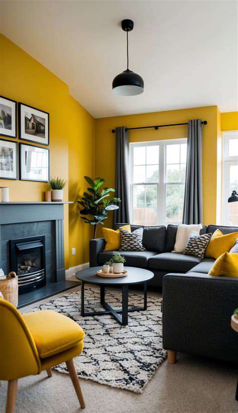
Balancing Bold Colors with Neutral Tones
Bold colors can add drama and character to a room, but they need to be balanced with neutral tones to prevent overwhelming the space. Neutrals, such as white, beige, gray, and black, provide a backdrop that allows bold colors to pop without feeling jarring. Using neutral walls as a canvas for colorful accents, furniture, or artwork can create a visually appealing balance.
Strategically placing pops of color through accessories, such as throw pillows, rugs, or artwork, can add vibrancy without overwhelming the overall aesthetic. This approach allows for a dynamic interplay between boldness and calmness, resulting in a well-balanced and visually engaging space.
The Role of Color in Accentuating Architectural Features
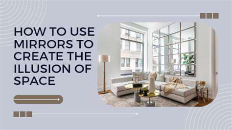
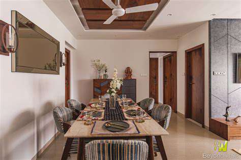
Color can be used to highlight and enhance architectural features within a home. A bold color on a fireplace surround, for example, can draw the eye to a focal point, while a lighter color can make a room feel more spacious. Consider how color can accentuate unique details, like beams, arches, or columns, turning them into visually captivating elements within the space.
Choosing colors that complement the existing materials and textures is essential for creating a cohesive and visually appealing design. For example, a warm wood floor might be beautifully complemented by a rich, earthy tone in a nearby wall.
Integrating Color with Personal Style and Mood
Ultimately, the use of color in interior design should reflect personal style and preferences. Consider the mood you want to create in each room and choose colors that evoke those feelings. A calming blue bedroom might be contrasted with a vibrant yellow kitchen, each reflecting the desired atmosphere for the space. Experiment with different shades and tones of color to find the perfect balance between your personal style and the desired ambiance in each room.
Don't be afraid to explore different color combinations and see what resonates with you. Ultimately, the most important aspect is to create a space that feels both visually appealing and emotionally fulfilling. This personal touch makes the space truly your own.
Beyond the Basics: Exploring Color Psychology and Personal Style
Understanding the Psychology of Color
Color psychology delves into the fascinating ways colors evoke emotions and associations in individuals. Different hues can stimulate various responses, from feelings of warmth and comfort to feelings of excitement and energy. Understanding these psychological effects is key to using color to enhance your personal style and create looks that truly resonate with you. This isn't just about picking pretty colors; it's about understanding how those colors make you feel and how they can be used to express your personality.
For instance, the vibrant energy of red can be empowering and stimulating, while the calming blue hues can promote relaxation and peace. Consider how these color associations play into your own personal preferences and goals when selecting colors for your wardrobe or home.
Color and Your Personality
Your personal style often reflects your personality. Colors can be powerful tools in expressing this. Do you gravitate towards bold, vibrant hues, suggesting a confident and outgoing personality? Or perhaps you prefer softer, more muted tones, hinting at a thoughtful and introspective nature? Experimenting with different colors can help you uncover hidden aspects of your personality and even inspire new ways of expressing yourself.
Understanding how different colors make you feel is vital. A color that evokes joy and confidence might be perfect for a work environment, while a color that brings peace and serenity might be ideal for a relaxed evening at home.
The Role of Color in Fashion
In fashion, color choices directly impact how you present yourself to the world. A well-chosen color palette can elevate your look, making you appear more confident, polished, and stylish. Conversely, poor color choices can make you look washed out, uninspired, or even detract from your overall appearance. Understanding color theory and how colors interact with each other is crucial in creating a cohesive and flattering wardrobe.
Consider how different colors can highlight or downplay certain features of your body. A bold color might draw attention to a particular area, while a neutral color might create a more balanced and subtle look.
Color Harmony and Contrast
Color harmony plays a significant role in creating visually appealing and balanced looks. Understanding color harmonies such as analogous, complementary, and triadic palettes can help you put together outfits that feel cohesive and visually interesting. Contrast, on the other hand, can be used to create visual interest and draw attention to specific elements of your style.
Experimenting with different color combinations can reveal unexpected and beautiful results. A seemingly simple combination of colors can transform an outfit, adding depth and sophistication to your overall style.
Seasonal Color Analysis and Style
Seasonal color analysis is a method for determining which colors best complement your natural coloring. By understanding your undertones (warm or cool) and your skin tone, you can select colors that enhance your natural beauty and create a stylish look. Different seasons have specific color palettes that are well-suited to different skin tones and features.
Knowing your seasonal color palette can help you avoid colors that clash with your natural coloring, allowing you to choose outfits that look beautiful and flattering. It's a great tool for discovering colors that truly make you shine.
Beyond Clothing: Color in Accessories and Home Decor
The principles of color psychology extend far beyond clothing. Applying these principles to accessories and home decor can enhance your overall style and create a more harmonious and aesthetically pleasing environment. Choosing colors that complement your personality and space can create a sense of comfort and well-being. Consider how colors influence mood and how these effects can be used to create specific atmospheres in different parts of your home.
From the vibrant hues of a scarf to the calming tones of a living room, color selection has a significant impact on the overall ambiance of a space. Consciously choosing colors in all aspects of your life can create a cohesive and personalized expression of your style and personality.
Read more about How to Achieve Stylish Home Interiors with Color Harmony