How to Enhance Interior Color Schemes with Full Package Renovation
Understanding the Psychology of Color
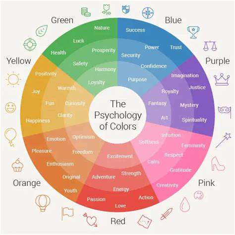
Color psychology influences how we perceive spaces and evoke emotions. Warm tones like reds and oranges spark energy, while cool blues and greens promote calm. Selecting hues isn't just about preference—it's about crafting an emotional experience. For instance, a pediatric clinic might use cheerful yellows, while a luxury spa would lean into serene aquamarines.
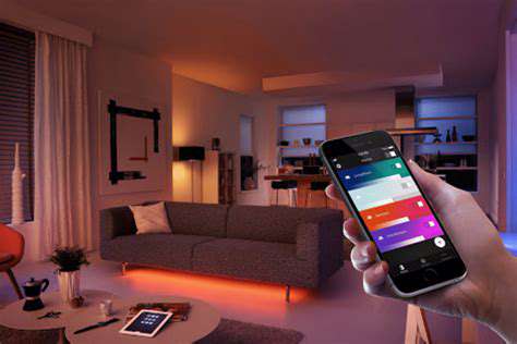
Lighting dramatically alters color perception. A sunflower yellow under warm incandescent lighting feels cozy, but under fluorescent lights, it may appear harsh. Always test swatches in the actual space at different times of day. Natural light reveals a color's truest character.
Considering Your Personal Style
Your living space should mirror your personality like a well-tailored suit. Minimalists might gravitate toward a monochromatic scheme with varying textures—think dove gray walls paired with charcoal linen drapes. Eclectic souls could embrace a vibrant clash of peacock teal and terracotta.
Create an inspiration board with fabric swatches, magazine clippings, and paint chips. Notice which combinations make your pulse quicken. Authenticity trumps trends—your home should tell your story, not a Pinterest board's.
Analyzing Existing Color Schemes
Study master painters for timeless combinations. Vermeer's use of ultramarine and gold creates luminous depth, while Matisse's bold fauvist palettes energize. Notice how high-end hotels layer five shades of beige to create richness without monotony.
When examining successful designs, ask: What's the dominant hue? How many accent colors appear? What percentage of the space uses neutral tones? Great color schemes follow the 60-30-10 rule: 60% dominant, 30% secondary, 10% accent.
Exploring Color Combinations and Harmony
Beyond basic color theory, consider advanced techniques like split-complementary schemes (one base plus two adjacent to its complement) for sophisticated contrast. A deep plum with sage and moss green offers depth without jarring contrast.
Test combinations using physical samples—digital screens distort saturation. Paint large poster boards and move them around the room. Observe how colors interact at different distances and lighting conditions.
Considering the Context and Application
A color that sings in a sun-drenched Miami condo may fall flat in a Seattle loft. Regional light quality matters—northern climates benefit from warmer undertones to counter gray skies.
Architectural features dictate color choices. Dark colors recede, making them ideal for highlighting crown molding. Light colors expand visually—perfect for small rooms. Always consider how colors interact with fixed elements like flooring or countertops.
Integrating Color Throughout the Renovation Process: From Walls to Accessories
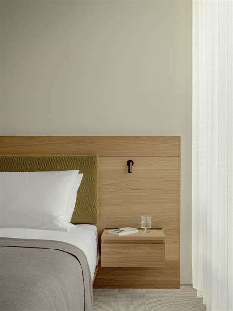
Integrating Color Harmoniously
Color integration requires strategic layering. Start with the largest surfaces (walls, floors), then medium elements (furniture, window treatments), finishing with accents (pillows, art). This creates visual hierarchy and prevents sensory overload.
Consider sight lines—how colors interact between rooms. A buttery yellow dining room should complement, not clash with, an adjacent sage green living room. Use transitional elements like area rugs with both hues to create flow.
Color Selection and Application
Sample paints on multiple walls before committing. Colors shift throughout the day—what looks perfect at noon may feel oppressive by evening. Live with test swatches for at least 72 hours.
For cohesive results, pull colors from existing elements you love (an heirloom rug, favorite artwork). This creates organic harmony rather than forced matching. Remember, slight variations add depth—your throw pillows needn't match the wall color exactly.
The Power of Contrasts and Accents: Creating Visual Interest
Using Complementary Colors for Visual Impact
Complementary colors create electricity when balanced properly. Instead of equal parts red and green, try 70% deep emerald with 30% crimson accents. This prevents holiday decor syndrome.
Employing Analogous Colors for a Harmonious Feel
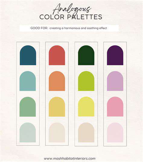
Analogous schemes benefit from value variation—pair a pale celery with a deep hunter green and mid-tone sage. Add metallic finishes (brushed brass, pewter) to prevent flatness.
Strategic Use of Contrasting Textures for Depth
Juxtapose matte walls with glossy trim. Combine nubby wool throws with smooth leather chairs. Texture contrast registers subconsciously as luxury. Even in monochromatic rooms, varied textures create dimension.
Accenting with Bold Patterns and Prints
Scale patterns to room size—oversized florals work in grand spaces, while petite geometries suit cozy nooks. Anchor bold prints with solid-colored furniture to prevent visual chaos.
Highlighting Architectural Features with Accents
Paint ceiling beams a shade darker than walls to emphasize height. Use satin finishes on trim to make them pop against matte walls. Strategic highlighting directs the eye to a room's best assets.
