Modern Color Design Solutions for Cohesive Home Interiors
Outline
Understand color theory to create harmonious interiors.
Choose a dominant color to unify your space.
Accent colors add personality without overpowering.
Test colors under different lighting before finalizing.
Incorporate natural light for enhanced color perception.
Use textures and patterns to enrich color stories.
Prioritize sustainable materials for eco-friendly design.
Infuse personal touches for unique interior aesthetics.
Choosing a Color Palette for Cohesion
Understanding Color Theory Basics
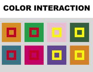
Let's start by exploring the color wheel - that circular rainbow you probably last saw in art class. This tool isn't just for painters; it's the secret weapon of interior designers. Primary colors form the foundation, while secondary and tertiary shades create endless possibilities. Ever notice how certain color combinations just feel right? That's complementary and analogous schemes working their magic.
Here's something fascinating: colors whisper to our emotions. That calming blue wall in your bedroom? Studies confirm it actually lowers heart rates. Meanwhile, that energizing red in your home office? It's not just bold - it's scientifically proven to boost creativity. Choosing colors isn't just about looks - it's crafting emotional experiences.
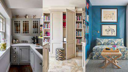
Choosing a Dominant Color
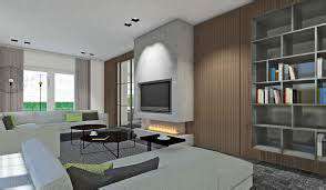
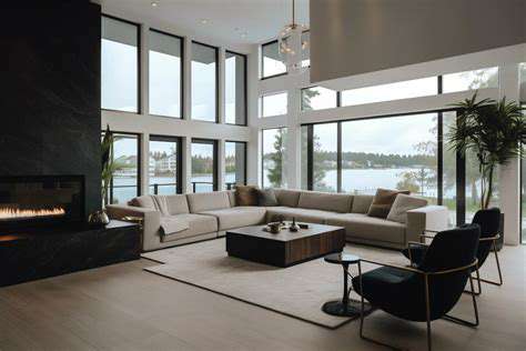
Your dominant color acts like the lead singer in a band - it sets the tone. Imagine walking into a living room where soft sage wraps around you like a warm hug. That's the power of choosing right. Bedrooms beg for soothing tones, while kitchens thrive with zesty citrus hues.
Try this pro trick: the 60-30-10 formula. Sixty percent dominant color forms your base, thirty percent secondary adds depth, and ten percent accent pops like exclamation points. Digital tools let you try on colors virtually - no messy paint samples required.
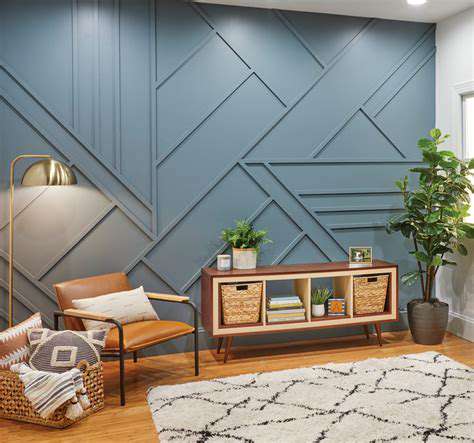
Incorporating Accent Colors
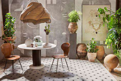
Accent colors are the spice rack of interior design. A single emerald green throw pillow can transform a beige sofa from bland to brilliant. Want to make your bookshelf sing? Paint its back wall burnt orange. Remember: accents should tease the eye, not scream for attention.
Three's the magic number for accents. More than that creates visual noise. Try pairing mustard yellow with navy blue, or blush pink with charcoal gray. These combos add sophistication without overwhelming.
Testing Your Color Palette
Never trust paint swatches in store lighting. That perfect gray might turn icy blue under your north-facing windows. Paint large test patches and observe them at dawn, noon, and dusk. Notice how artificial light from your lamps alters colors at night.
Create a physical mood board - it's like Tinder for colors. Swipe right on fabric samples that make your heart sing, left on those that clash. This hands-on approach helps spot mismatches that digital simulations miss.
Incorporating Accent Colors with Purpose
Understanding Color Psychology
Colors speak a silent language. That vibrant red accent wall? It's not just pretty - it subconsciously boosts conversation in dining areas. Cool blues in home offices can increase focus by up to 30%, according to workplace psychology studies.
Choosing Trend-Forward Accents
Pantone's Color of the Year isn't just marketing - it's a cheat code for modern spaces. This year's earthy terracotta pairs beautifully with natural materials like rattan and linen. Pro tip: Use trendy colors in replaceable items like cushion covers rather than permanent fixtures.
Balancing Act
Ever seen a room that feels too much? That's accent overload. The 10% rule isn't just math - it's visual breathing space. Try framing bold colors with neutral backdrops. A crimson armchair against white walls becomes an instant focal point, not a visual assault.
Flow Between Spaces
Carry accent colors through your home like musical motifs. Maybe echo the kitchen's brass handles in the living room lamp bases. This creates rhythm without repetition, making your home feel curated rather than matchy-matchy.
Read more about Modern Color Design Solutions for Cohesive Home Interiors