How to Plan a Creative Home Color Scheme
Understanding Your Personal Style
Defining your design aesthetic is a deeply personal journey. It's about recognizing the elements that resonate with you, the feelings you want to evoke, and the stories you want to tell through your choices. Think about the environments you find most inspiring – a cozy cabin in the woods, a bustling city street, a serene beach. These visual cues can offer valuable insights into the mood and atmosphere you want to cultivate in your design palette.
Consider what colors, textures, and shapes instinctively draw you in. Are you drawn to bold, contrasting colors, or do subtle, muted tones speak to your sensibilities? Pay attention to the details that grab your attention and the overall feel that resonates with you. Understanding this personal connection is the cornerstone of crafting a color palette that truly reflects your unique style.
Exploring Color Psychology
Color psychology plays a significant role in setting the tone and mood of a design. Different colors evoke different emotions and associations. For example, warm colors like red and orange often convey energy and excitement, while cool colors like blue and green can inspire calm and tranquility. Understanding these associations can help you choose colors that effectively communicate the desired feeling in your space.
Considering Your Space's Function
The function of the space you're designing significantly impacts the colors you choose. A vibrant, energetic color palette might be ideal for a playroom or a kitchen, while a more calming palette could be more suitable for a bedroom or a study. Take into account the activities that will occur in the space and select colors that complement and enhance those activities. This careful consideration ensures that your color choices not only look beautiful but also contribute to the overall functionality and feel of the space.
Analyzing Existing Design Elements
Before diving into color selection, carefully analyze existing design elements within the space. Consider the architecture, furniture, and any existing artwork. These pre-existing elements will serve as a foundation upon which your color palette will be built. Understanding the current design influences can help you select colors that harmonize and complement rather than clash with what's already there. This ensures a cohesive and well-balanced aesthetic.
Researching Color Combinations
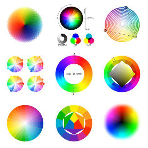
Extensive research into color combinations is essential for creating a harmonious and visually appealing design. Explore various color palettes online or in design books, noting which combinations resonate with your sense of style. Consider the principles of color theory, such as complementary, analogous, and triadic color schemes. Experiment with different color pairings to find combinations that capture the essence of your design aesthetic and create a cohesive and visually stunning result.
Understanding the Impact of Lighting
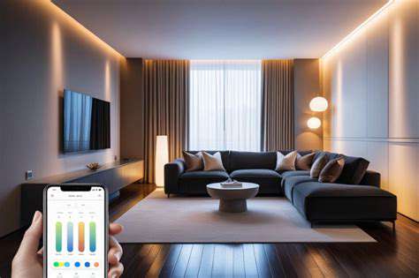
Lighting significantly affects how colors appear in a space. Natural light and artificial lighting can dramatically alter the perception of colors. Consider the amount and type of light that will be in the space when making your color choices. Colors that appear vibrant in natural light might appear muted under artificial lighting. Testing colors under different lighting conditions is crucial for ensuring the palette looks as intended in the actual space.
Choosing Your Primary Color: The Star of the Show
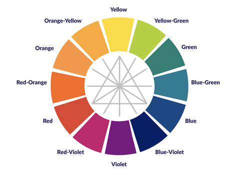
Choosing Your Primary Color: Understanding the Psychology of Color
Selecting a primary color for your design project is crucial, as it sets the overall tone and evokes specific emotions in your audience. Understanding the psychological impact of color is paramount in achieving your desired effect. Different colors evoke different feelings, from tranquility and calm to excitement and energy. Therefore, selecting the right color is vital to conveying the intended message and achieving the desired response.
Consider the feelings you want to evoke in your viewers. Do you want to inspire confidence, create a sense of playfulness, or project sophistication? Each color carries a unique emotional weight, and understanding this is key to effective design.
Color Psychology and Brand Identity
Color plays a significant role in establishing and reinforcing a brand's identity. A consistent use of certain colors can create a strong visual association with your brand, making it easily recognizable and memorable in the marketplace. Color psychology is a powerful tool in brand building, effectively communicating your brand's values and personality. A carefully considered color choice can significantly impact how your target audience perceives your brand.
Brands often use color palettes to communicate specific values. For example, blue is often associated with trust and reliability, while red might signify energy and excitement. Understanding these associations allows you to strategically use color to align with your brand's identity and communicate the desired message.
The Impact of Color on Mood and Perception
Different colors evoke different moods and perceptions. Warm colors, like red and orange, can create feelings of excitement, energy, and warmth. Cool colors, such as blue and green, often inspire feelings of calmness, tranquility, and serenity. The color you choose can influence how viewers perceive the overall message and tone of your design. This impact is not always direct, but it can significantly affect the overall experience.
Consider how a specific color might affect your target audience. If you're aiming for a relaxing and calming atmosphere, cool colors might be the ideal choice. If you're designing for a vibrant and energetic brand, warm colors might be more appropriate.
Analyzing Your Target Audience
Understanding your target audience is essential for choosing the right primary color. Different demographics respond to different colors in various ways. Consider the age, culture, and preferences of your audience when making your color selection. Knowing your audience is key to effectively communicating with them through your design choices. Tailoring your color palette to your target audience can significantly improve engagement and understanding.
Thorough market research and audience analysis can provide valuable insights into the preferences and associations your target audience holds with specific colors. This information can be instrumental in choosing a color that resonates effectively with your intended audience.
Color Combinations and Harmony
Choosing your primary color is only one part of the equation. You also need to consider how it interacts with other colors in your design. Color combinations can create harmony, contrast, or even tension, all of which contribute to the overall aesthetic and impact of your design. Harmonious color combinations can create a visually appealing and balanced design. Conversely, contrasting color combinations can create a more dynamic and impactful effect.
Considering the Context of Your Design
The context of your design significantly influences the impact of your primary color choice. The intended use of your design—whether it's a website, a logo, a product packaging, or a marketing campaign—will influence the appropriateness of certain colors. A color that works well for one context may not be suitable for another. Careful consideration of the overall design context is crucial.
A color that evokes a sense of sophistication in a luxury brand may appear inappropriate in a children's product. The design context plays a critical role in shaping the effectiveness and appropriateness of your color choices.
Testing and Iterating on Your Color Choice
After selecting your primary color, it's essential to test and iterate on your choice. Gather feedback from potential users or stakeholders to understand how the color resonates with them. Iterative design processes are crucial for optimizing your color choices. Based on the feedback, you can refine your color selection to ensure it effectively communicates your message and resonates with your audience. This process is essential for creating a successful design.
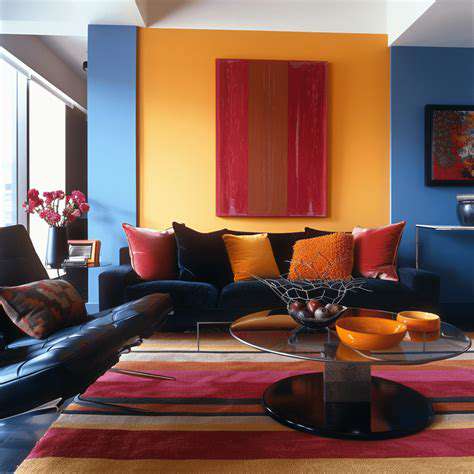
Considering the Impact of Neutrals: Creating a Foundation of Calm
Understanding the Role of Neutrals in Design
Neutral colors, such as beige, gray, and white, serve as a crucial foundation in design. They provide a calming and versatile backdrop for accent colors and patterns to shine. In interior design, for example, a neutral color palette allows for flexibility in furniture and decor choices, creating a space that feels both sophisticated and adaptable to changing tastes. Employing neutrals wisely creates a sense of tranquility and allows the eye to rest, making the space feel more inviting and less overwhelming.
Beyond color, neutrals can also include textures and materials. Consider the interplay of smooth fabrics like linen against rough-hewn wood. These contrasting yet complementary elements within a neutral color scheme can create a rich and layered aesthetic, adding depth and complexity to the overall design.
Establishing a Sense of Calm and Tranquility
Neutral palettes are frequently used to promote a sense of calm and tranquility. They create a soothing environment conducive to relaxation and focus. This is particularly important in spaces designed for rest and rejuvenation, such as bedrooms and meditation rooms. The absence of strong, jarring colors allows the mind to quiet and encourages a sense of inner peace.
Utilizing Neutrals for Visual Harmony
Neutrals act as a unifying element in design, creating visual harmony. They allow different elements within a space to blend seamlessly, preventing visual clutter and promoting a cohesive aesthetic. By incorporating neutrals, you can create a sense of order and balance, making the space feel more inviting and aesthetically pleasing.
The use of neutrals can also help to create a sense of spaciousness. This is particularly true in smaller rooms where a neutral color palette can help to reflect light and make the room feel larger.
Incorporating Accents for Visual Interest
While neutrals provide a calm backdrop, incorporating carefully chosen accents is crucial for adding visual interest and personality. Accents can be anything from vibrant artwork to patterned rugs or colorful throws. Strategic placement of these accents helps to break up the monotony of pure neutrals and creates a more dynamic and engaging space.
Creating a Foundation for Adaptability and Longevity
Neutral color schemes are incredibly adaptable. They can easily be updated and modified to reflect changing trends or personal preferences without requiring a complete overhaul of the entire space. This adaptability makes neutral palettes a smart investment for long-term design.
This longevity aspect is especially valuable for interior spaces. The neutral foundation allows for easy changes to furniture, artwork, and accessories, keeping the space fresh and relevant for years to come. This eliminates the need for frequent, costly updates, making it a truly smart design choice.
The Psychology of Neutrals in Design
Neutrals often evoke feelings of serenity and stability. The absence of strong emotions associated with vibrant colors allows the viewer to focus on other aspects of the design, such as texture, form, and light. This can lead to a more calming and focused environment that is conducive to relaxation or productivity.
Furthermore, the versatility of neutrals in design allows for a wide range of personal expression. While the base remains consistent, the integration of personal touches through accessories and accents allows for the space to reflect the unique tastes and preferences of the individual or family using it.


